.svg)
We Audited 96 Connections Before Trusting the Marketing Analytics Dashboard
Our audit of 96 reporting connections showed why dashboard trust depends on source freshness, shared definitions, and traceable records—not connection status alone.
Our marketing analytics dashboard audit started below the charts
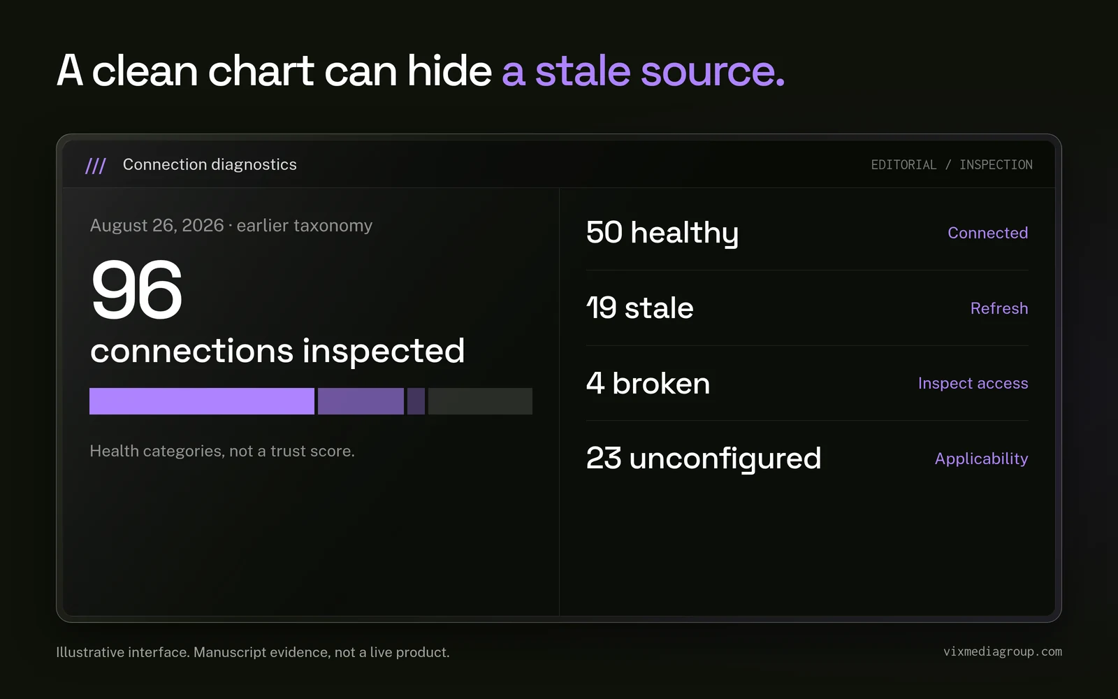
A marketing analytics dashboard is only useful when its source health, definitions, and refresh rules are visible. On August 26, 2026, we reviewed a dated portfolio inventory of 96 reporting connections and found 50 healthy, 19 stale, 4 broken, and 23 unconfigured at that moment.
Those statuses changed the work. Our data unification services begin below the presentation layer because a polished chart can still rest on an aging source, the wrong account, or a conversion event that means something different in another system.
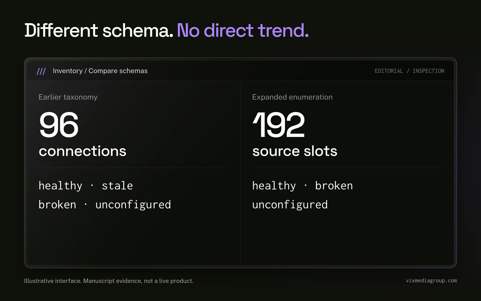
The 96 connections were not the current size of our platform. They belonged to an earlier source taxonomy, and our later inventory expanded to 192 enumerated source slots across 16 clients and 24 sites. The two inventories are not directly comparable, so we keep the date and schema attached to the original finding.
What did the 96 reporting connections actually represent?
The 96 connections represented the reporting surface we expected to inspect, not 96 equally valuable or complete data streams. The inventory covered GA4, Google Search Console, Google Business Profile, Ahrefs, Google Ads, Facebook Ads, TikTok Ads, and BigCommerce where those systems applied.
A source slot could be healthy, stale, broken, or unconfigured. Those labels helped us triage the infrastructure, but they did not answer whether a connection carried the fields required for a business decision.
A healthy connection was not a certificate of trustworthy attribution
A healthy status meant the source was connected and behaving within the health rules used at that point. It did not prove that campaign identifiers survived every handoff, that CRM stages were defined consistently, or that revenue could be reconciled to the original contact.
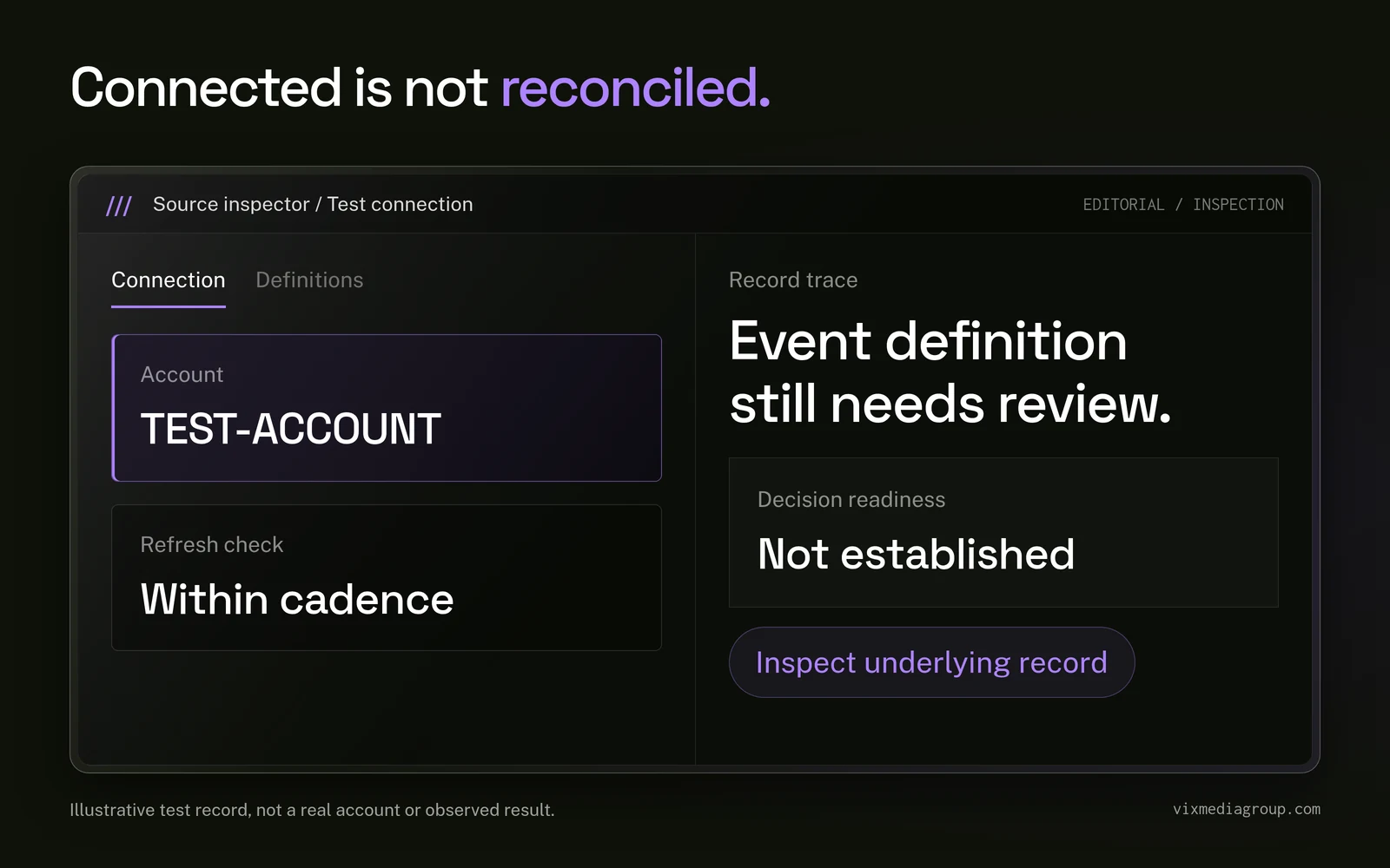
We separated four questions that dashboards often compress into one:
- Is the intended account connected?
- Is the source refreshing on the expected cadence?
- Do its events and fields have shared definitions?
- Can an operator trace a decision back to the underlying record?
Only the first two questions primarily concern connection health. The third concerns governance. The fourth concerns whether reporting can support action.
An unconfigured source was not automatically a failure
An unconfigured slot could indicate unfinished work, but it could also represent a source that did not apply to that business. Treating every blank as a defect would have produced a misleading completion score.
We changed the operating record so each source could carry its applicability, expected cadence, and escalation owner. That distinction let us prioritize a broken required source over an irrelevant unconfigured slot.
Why was the obvious dashboard explanation incomplete?
The obvious explanation was that 50 of 96 connections were healthy, so the dashboard was roughly half trustworthy. That conclusion would have been false.
Health categories are not a confidence percentage. One broken advertising source could block a channel review, while several unconfigured sources might have no effect on the questions the company needed to answer. The decision determines which source matters.
Source freshness can change the meaning of a clean visualization
A stale chart can remain visually convincing because its last successful values still render. Without a visible freshness indicator, an operator may interpret an old value as a current condition.
We therefore inspect timestamps, expected update schedules, and recent failures before discussing trend lines. The chart comes after the source check, not before it.
Changing taxonomies can manufacture false trends
Our later inventory expanded to eight source types and 192 enumerated slots. At the August 26 check, that expanded inventory showed 77 healthy, 106 unconfigured, and 9 broken, with 86 configured.
We do not compare that total directly with the earlier 96-slot count. The schema changed, the roster context changed, and the stale category no longer appeared in the same way. A rising total would reflect expanded enumeration as well as any operational change.
This is also why a new measurement source needs a documented cohort boundary before it enters a portfolio benchmark. Adding a source type expands the map. It does not retroactively prove that prior periods were missing the same number of connections.
The data revealed four different classes of repair
The audit gave us a repair queue, not a single dashboard score. We separated the work by the condition that prevented a source from supporting a decision.
The four repair classes were:
- Reconnect required sources when credentials, permissions, or account selections were wrong.
- Refresh aging sources when their latest usable data fell outside the expected cadence.
- Configure applicable sources when the business used the platform but reporting was not wired.
- Document non-applicable sources so blanks did not become recurring false alarms.
Each class required a different owner and completion test. A credential problem belonged with access management. A missing event definition belonged with analytics governance. A CRM stage mismatch belonged with revenue operations.
We made ownership part of the source map
A status without an owner can stay visible for weeks without changing. We attached source failures to people who could inspect credentials, platform access, field mappings, or downstream records.
Our CRM configuration work matters at this stage because source data becomes commercially useful only when lifecycle stages, ownership, and required fields support the same questions as the dashboard.
Two systems can be individually accurate and still disagree. They may use different time zones, attribution windows, identities, or event definitions. We treat that disagreement as an investigation prompt rather than averaging the totals until the discrepancy disappears.
What changed after we stopped treating the dashboard as a finished product?
We turned the dashboard into an operating review of sources, definitions, and decisions. The visual layer remained useful, but it no longer carried more certainty than the infrastructure could support.
Our review sequence became:
- Confirm the business question and the person who owns the decision.
- Identify the minimum sources and fields needed to answer it.
- Inspect account selection, freshness, failures, and applicability.
- Reconcile event and lifecycle definitions across platforms.
- Trace a sample record through the relevant handoffs.
- Document gaps, owners, and the next verification date.
This sequence reduced arguments about which dashboard was correct. It redirected the discussion toward why the records differed and what evidence would resolve the difference.
Attribution required a chain, not another visualization
A lead in an advertising platform may mean a submitted form. In the CRM, that form can become a duplicate, an invalid contact, a qualified opportunity, a booked appointment, or a customer. Each label belongs to a different stage.
Our attribution tracking approach preserves source identifiers, campaign rules, conversion definitions, and downstream outcomes so operators can inspect that chain without pretending every platform conversion is revenue.
The same separation applies when new referral categories enter analytics. A visible referral can support a visit claim. It does not automatically support a lead, conversion, or revenue claim.
What happened next is evidence about infrastructure, not performance
The audit showed where connections were healthy, stale, broken, or unconfigured on August 26, 2026. It did not establish that repairing a connection increased traffic, leads, or revenue.
The later source taxonomy also prevents us from presenting 96 as a current inventory total. The expanded check enumerated 192 slots, but that number describes a different schema. It is evidence that the reporting surface evolved, not proof of portfolio growth or improved measurement quality.
We can support a narrower conclusion: only 50 of the 96 mapped connections were healthy at the audited moment, and the review exposed why source status, applicability, definitions, and ownership must remain visible beside dashboard output.
What would we do differently in the next portfolio audit?
We would design the comparison rules before counting connections. A stable inventory needs a versioned source taxonomy, an applicability standard, and a consistent definition for every health label.
Our next audit specification would require:
- A version number for the source taxonomy.
- A roster date and explicit cohort boundary.
- A required, optional, or non-applicable label for every slot.
- A documented freshness threshold for each source type.
- A named owner and escalation route for every required connection.
- A reconciliation test for the decisions each source supports.
- A change log before any historical comparison is published.
That structure would let us compare like with like. If the taxonomy changed, we could restate the historical cohort or keep the periods separate instead of drawing a trend across incompatible inventories.
We would also preserve record-level tests beside aggregate checks. A dashboard can reconcile at the total level while individual contacts lose their source, ownership, or outcome during a handoff.
How Vix builds a marketing analytics dashboard operators can challenge
Vix connects data infrastructure, attribution rules, CRM design, and operating decisions. We do not treat dashboard production as the final step because the questions continue after the charts render.
Our marketing tools support inspection and analysis, but tools do not replace source governance. Operators still need to know which account is connected, when it refreshed, what each event means, and who owns the next action.
A useful dashboard can survive a skeptical meeting. Its numbers can be traced, its gaps are visible, and its definitions do not change when a different team opens the report.
The lesson from 96 connections was not that more integrations create better measurement. It was that every source needs a known purpose, condition, definition, and owner. A marketing analytics dashboard earns trust when the team can inspect the plumbing, explain the limits, and act on the evidence without hiding uncertainty behind a clean chart.

.svg)



Do you remember the last caption you read on Instagram last night? What was the last reel you watched on Facebook about? If you cannot answer one of these questions, you’re not alone. There's plenty of content online, from Google search results to social media posts and how-to videos and articles.




Video marketing is the future of content in the digital world, and for good reason. This type of marketing is a more enjoyable way to share your ideas and a great medium for reaching people on the go. Here are the reasons why video marketing is the future of content.

Small business owners may see SEO as an unnecessary expense but this could not be further from the truth. SEO is increasing in importance, it used to play a major role for only large and midsize businesses. Now, it is just as crucial for small businesses…
Start Growing Your Dental Practice with SEO
Take the first step toward transforming your marketing. Whether you’re looking to boost engagement, improve your online presence, or grow your business, our team at Vix Media Group is here to help.
Let’s craft a strategy tailored to your goals.